
When we hear “ADA compliance,” many think of lawsuits and legal jargon. But what if we saw these standards as blueprints for a fairer world? It’s not just about following rules; it’s about creating a world where everyone belongs.
Let’s forget the legal details for now. The ADA Standards for Accessible Design are more than rules. They are a design philosophy. Laws like Ontario’s AODA guide us in building a world for all. It’s not just about ramps and door sizes; it’s about blueprints for inclusion.
This framework is not a limit on creativity. It’s a foundation. A well-designed space, like a website or public area, doesn’t just meet legal standards. It offers a smooth, easy experience for everyone. It’s the difference between a building with a makeshift ramp and one with a welcoming main entrance.
Think of a city planning a big event. The success of such an event often depends on ADA compliance. A well-planned event, like a sports game, needs careful planning for all guests. It’s about designing with purpose, not fixing later. This blend of legal standards and human design creates welcoming spaces and digital experiences.
Seating, Paths, and Restrooms
Inclusive design is more than just following rules. It’s about creating spaces where the design fades away, leaving only the experience. Think about the last time you visited a place that was truly accessible. Did you notice the path’s width or just moved from one point to another without thinking?
That’s the goal. When accessibility is invisible, you just enjoy the moment. The wheelchair ramp blends in seamlessly, not sticking out as an afterthought.
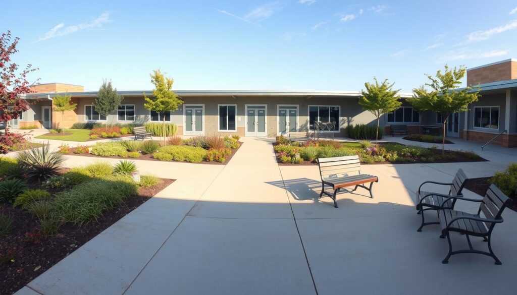
The ADA Standards and the AODA’s “Design of public spaces” standard give us the basics. But it’s how we apply these rules that truly matters.
Paths are a key part of this. They need to be at least 36 inches wide, with 48 inches at passing spaces. The slope and surface must be just right.
But what makes a path truly navigable? It should have clear sight lines and avoid sudden turns. It should also be easy for those using canes or with limited vision. The difference is like comparing a rigid flowchart to a flowing river.
Seating is another challenge. The ADA requires specific wheelchair spaces and companion seating. But true inclusive design asks if these seats are where people want to be.
Are the accessible seats in the best spots? Or are they hidden away? Can someone in a wheelchair fully join in, or are they just watching?
When accessible seating is integrated, not separated, something special happens. The space becomes welcoming to everyone.
The restroom is another critical area. It’s where technical rules meet human needs. The ADA’s Chapter 6 on toilet rooms outlines the details.
But a restroom designed with care is different. The door opens easily, and the transfer space is generous. The sink, soap, and dryer are within reach without straining. The mirror is placed for someone sitting. These details show thoughtfulness, not just accessibility.
The table below shows the difference between technical compliance and inclusive design:
| Design Element | Technical Compliance (The Checklist) | Inclusive Design (The Experience) | Why the Difference Matters |
|---|---|---|---|
| Accessible Route | 36″ minimum width, proper slope, firm surface | Intuitive flow, clear sight lines, natural integration with landscape | Compliance gets you in the door; intuitive design lets you participate |
| Seating Areas | Required number of wheelchair spaces, companion seats | Integrated placement, comparable sight lines, social participation enabled | Seating placement affects social inclusion—corner seats create second-class experiences |
| Restroom Facilities | Proper clearances, grab bar specifications, sink height | Seamless operation, thoughtful fixture placement, dignity preserved | The restroom test often reveals whether design was an afterthought or a principle |
| Wayfinding | Braille signage at required heights, visual contrast | Multi-sensory cues, intuitive layout, reduced cognitive load | Good wayfinding helps everyone; great wayfinding is inherently universal |
Notice the pattern? Technical compliance focuses on measurable thresholds. Inclusive design focuses on human experience. One asks “Does it meet code?” The other asks “Does it work for people?”
This philosophy changes how we design public spaces. An extra inch of turning space in a restroom can be a game-changer. A gentle curve in a pathway helps everyone navigate better.
The magic happens when we design with accessibility in mind. The path becomes a journey, the seat a place to be, and the restroom a space of dignity. It’s not just about meeting standards; it’s about creating a welcoming environment.
This is the subtle art we’re discussing. It’s not just making spaces accessible; it’s making accessibility seamless. When done right, you don’t even notice the design. You just enjoy the event.
Sensory Rooms and Inclusive Amenities
Think of a sensory room as a special feature, not just a luxury. It’s like noise-canceling headphones for a world that’s too loud. We’ve made buildings more accessible by adding ramps and widening doors. But what about the people who find bright lights and loud noises overwhelming?
The idea of universal access is evolving. It’s not just about moving around easily. It’s about being able to handle the world’s sensory inputs without feeling overwhelmed.
A sensory room can be different things for different people. For some, it’s a quiet, dim place to escape the noise. For others, it might have special textures, weighted blankets, or calming patterns. The key is giving people control over their senses.
True universal access means understanding that everyone experiences the world differently. People with neurodiversity, PTSD, or sensory sensitivities aren’t asking for special treatment. They just want to be able to join in without feeling pain.
Here’s what really works, not just what looks good:
| Sensory Element | Purpose/Function | Implementation Notes |
|---|---|---|
| Adjustable Lighting | Reduces glare, prevents migraines, creates calm | Dimmable LEDs with warm color temperatures; avoid fluorescent entirely |
| Acoustic Management | Controls noise bleed, offers sound masking | Sound-absorbing panels, white noise machines, separate ventilation noise |
| Tactile Stations | Provides grounding, reduces anxiety | Textured walls, fidget tools, weighted lap pads (sanitized between uses) |
| Visual Calm Zone | Minimizes visual clutter and overstimulation | Simple sightlines, neutral colors, no competing digital screens |
| Climate Control | Addresses temperature sensitivities | Independent thermostat, good air circulation without strong drafts |
Notice what’s missing from that table? The word “compliance.” This isn’t about meeting a minimum standard. It’s about creating sanctuaries. A well-designed sensory room tells your attendees: “Your way of experiencing the world is valid here.”
Now think about your whole venue. Are there quiet spots near busy areas? Can someone get away from loud music without leaving the building?
The lighting in your hallways—does it flicker and cause problems for some? The hand dryers in your bathrooms—do they sound like jet engines? These details are important. For more on designing for diverse sensory needs, there’s great research out there.
This approach makes universal access a competitive edge. You’re not just accommodating people. You’re welcoming communities that were once left out. You’re saying your event is for all kinds of thinkers, feelers, and processors.
Think of it this way: a concert with only one volume level excludes both the hearing-sensitive and the hard-of-hearing. A space with only one sensory volume does the same. The inclusive venue offers a range of volumes—literal and metaphorical—so everyone can find their comfort zone.
That’s the real goal. Not just access, but belonging. Not just attendance, but engagement. When someone can retreat, regulate, and return, they’re not just present. They’re participating. And that’s when events truly come alive.
Volunteer Training and Signage
Even with the best accessibility plans and ramps, your event’s accessibility depends on your team. True ADA compliance is more than a policy; it’s a practice. This part is about turning your volunteers into accessibility experts and your signs into guides for everyone.
Your volunteers are the face of your event’s culture. If they only know how to scan tickets and point to the bathroom, you’re missing the point. ADA compliance in action is a volunteer who doesn’t just point to a ramp, but confidently says, “The accessible seating is this way, and I can guide you. The accessible restrooms are to your left, and we have a quiet room on the second floor if you need a sensory break.”

Changing how you train volunteers is key. It’s not just a one-hour lecture. It’s about shifting their mindset. We’re not teaching them to “deal with” accessibility; we’re empowering them to make your event welcoming for everyone.
From Policy to Practice: The “P.A.T.H.” Framework for Volunteers
Effective training goes beyond a list of rules. We use a simple framework: P.A.T.H.
- People-First Language: Train volunteers to use person-first language (e.g., “a person with a visual impairment” not “a blind person”). It’s a subtle but profound shift in perspective.
- Ask, Don’t Assume: The golden rule of accessibility. Volunteers should be trained to ask, “How can I best assist you?” instead of making assumptions about what a person can or cannot do.
- Think Holistically: Accessibility isn’t just about mobility. Train volunteers to be aware of sensory needs (e.g., lowering the volume on a microphone, knowing the location of the quiet room).
- Help, Don’t Hover: The goal is to offer support without being intrusive. Volunteers should be taught to offer assistance, but respect a person’s independence and autonomy. The offer itself is a sign of a prepared and considerate event.
Real-world scenario training is key. Role-play scenarios are invaluable. For example: “A guest with a service animal approaches the information booth. The volunteer is trained not to ask for documentation, but to simply say, ‘Your service animal is welcome. How can I help you today?'” This moves beyond legal compliance to genuine hospitality.
Signage: Your Silent, 24/7 Volunteer
Signage is your silent, 24/7 volunteer. It should guide, inform, and reassure. Effective, accessible signage is multi-sensory and intuitive. Let’s break down the elements of inclusive signage:
| Signage Element | Traditional Approach | Accessible, Multi-Sensory Approach |
|---|---|---|
| Format | Small text, complex fonts, low-contrast colors. | High-contrast (e.g., black on yellow or white on dark blue), sans-serif fonts, large print, and Braille or tactile lettering. |
| Icons & Pictograms | Generic or unclear symbols. | Use of ISO 7001 standard symbols (e.g., for restrooms, first aid). Pair with clear, simple text. |
| Information | “Restrooms” with an arrow. | “Accessible, All-Gender Restroom, 50 ft ahead. Braille and tactile map on adjacent post.” |
| Placement | At a standard height, often above eye level for some. | At a consistent height (approx. 48-60 inches from the ground) and placed to avoid glare. QR codes can link to audio descriptions. |
Great signage doesn’t just direct; it empowers. It answers the question before it’s asked. “Where is the quiet room?” is answered by a clear, tactile map at every major junction. “Where is the accessible entrance?” is answered by a ground-level, well-lit, high-contrast sign that doesn’t require a 20/20 vision to read from 20 feet away.
Ultimately, ADA compliance in action is a blend of human empathy and clear, physical guidance. Your volunteers are the heart of this system, and your signage is its nervous system. By investing in thorough, scenario-based training and thoughtful, multi-sensory signage, you create an environment of belonging. You’re not just hosting an event; you’re curating an experience where everyone knows they were planned for and are genuinely welcome.
Inclusive Event-Day Operations
Planning is key, but it’s nothing without smooth event-day operations. Inclusive design shines when it meets the real world. A sudden rain or a surprise guest can change everything.
The ADA talks about “program access,” not just following rules. It’s about making your event accessible as it happens. The AODA goes further, making accessibility a part of everything you do.
Let’s look at an event day through accessibility eyes. Imagine someone arriving in a wheelchair-accessible shuttle. The drop-off looks good on the map, but is there someone directing traffic? Is the path clear of unexpected obstacles?
This planning is key. It makes the entrance smooth or a frustrating obstacle course.
At the main stage, real-time captioning is a must. But where do you put the captions? A single screen might block half the audience. The goal is multiple screens or personal devices.
Quiet hours in marketplaces are another smart move. They help those who are overwhelmed. It’s not just nice; it’s a commitment to making the event accessible.
Restrooms are a big challenge. All-gender, accessible facilities are great, but what at peak hours? You need more stalls and clear monitoring to prevent misuse.
The table below shows common challenges and solutions:
| Operational Challenge | Inclusive Solution | Key Consideration | ADA/AODA Connection |
|---|---|---|---|
| Crowded entry points creating mobility device gridlock | Dedicated accessible ingress lanes with visible staff stewards | Staff must be trained to manage queues firmly but politely | ADA Title III: Effective communication & reasonable modifications for access |
| Main stage audio inaccessible to D/deaf or hard-of-hearing attendees | Real-time CART on multiple screens + assistive listening device checkout station | Have a backup captioner on call; test tech during sound check | AODA Integrated Standards: Communication supports as part of service delivery |
| Overstimulating marketplace causing sensory distress | Scheduled “quiet hours” with vendor cooperation & posted schedules | Marketplace layout should include lower-stimulation zones | ADA’s “program access” includes full & equal enjoyment of all activities |
| Restroom congestion making accessible stalls unusably slow | Cluster multiple accessible stalls together; implement family/all-gender restroom areas | Signage must clearly distinguish between stall types; consider a mobile app wait-time alert | ADA Standards §213: Scoping for toilet facilities; AODA emphasis on dignity |
That image shows what event operations should look like—a smooth flow. The key is in the transitions. How do you move people from a show to food areas? Are paths wide enough for two wheelchairs?
At the end, it’s all about getting people out safely. Accessible shuttles must run often. Pathways must stay clear as vendors pack up. The commitment to inclusive design lasts until everyone leaves.
This mindset turns following rules into a great experience. It’s about adapting and including in the chaos of the day. It’s the staff member who fixes a problem or the quick solution when something goes wrong.
Audit Checklist
Your event’s plan is ready. Now, we need the final check. This audit is not just about ticking boxes. It’s about understanding the ADA Standards and AODA compliance reports deeply.
Don’t just check the handrails. Ask deeper questions. Is your accessible seating truly integrated, not stuck in a corner? Does your website work well with screen readers, just like your physical space does with wheelchairs? Meeting the technical standards is just the start. The real goal is to make everyone feel welcome.
Your online presence also needs careful review. A detailed website accessibility audit checklist is essential. It checks more than just color contrast. It tests if your site works well with keyboards and has good alt text. Think of it as your last chance to ensure universal access.
This check turns compliance into the core of your event. When every detail passes, you’re not just hosting an event. You’re creating an experience designed for everyone, from the start.
